The Windows Store Submission Process

I recently got access to the Windows Store, and submitted my first app, “The game of Bao”, a simple and fun board game I learned when we visited Malawi, Africa during our honeymoon (any money the game makes will be donated back to an organization working on improving the lives of the kids that taught us this game, so please be kind and play it a lot and give some great reviews :-).

I recorded the steps that I have had to go through so you can see what you need to have ready if you need to submit an app yourself.

*Note: Currently access to the Windows Store is limited to either companies and people who goes through an “App Excellence Lab”. Once your app gets the “seal of approval” from a Microsoft Engineer, you’ll get an invite code so you can create an account for the Windows Store.

When you sign into the windows store, the first thing you’re greeted with is the dashboard, where you can submit an app.

image

Clicking “Submit an app” brings you to a list of the steps you have to go through. You work your way through them from top to bottom (you can always go back and change stuff as long as you haven’t submitted yet):

image

First step is to give you application a name. This is a unique name, so if someone else already published an app with that name, you’ll have to come up with a different name. Also note the mention that your app’s manifest must have the exact same DisplayName set. You can also reserve your app name this way, and later finish the app submission process when your app is ready.image

The next step is the selling details. There’s quite a lot to fill out here, but still pretty straightforward:

image

The next page allows you to configure in-app purchase (you can add as many as you want, ranging from $1.49 up to $999.99):

image

The next step is the age rating. Make sure you read the “small” print. If your app has access to the internet, chances are you can’t go with the lowest rating, no matter how PG your app is. Also note that for some countries a rating certificate is required to be able to publish there (I have no clue how to get these though):

image

Next step is declaring whether your app uses any form of cryptography (there’s a lot of export restrictions on that technology). You either say yes or no. If you pick yes, you’ll be asked a few more questions about this:

image

Next step is to upload your app package. In Visual Studio, select “Project –> Store –> Create App Packages…”

image

Pick for Windows Store.

image

You’ll then be asked to sign in. It’ll find the app name you reserved in the first step and then generate the .appxupload package that you’ll need in the next step:

image

Next is the app description. You’ll need 1-8 screenshots (1366x768), Promotional Images (846x468,558x756,414x468,414x80) keywords, app features, Description, web-link to Privacy Policy (if you have internet-enabled your app), description of all in-app purchace options to name a few.

image

Last step is to optionally include some notes to the testers:

image

When you’re done, you should be back at the overview page with all check-marks:

image

Either review your data, or hit “Submit for certification”. All you can do now is sit back and wait for the app to go through. There’s an estimate listed of how long each step usually takes.

image

Running a Storyboard as a Task

Sometimes you have some code that needs to run after a storyboard has completed. In my case I'm working on a little board game, and after each move (which I animate using a Storyboard), I need to figure out the next move, and either start a new play-animation or pass the turn to the other player.

Therefore I run in a loop until the turn is over. You can detect when a storyboard has finished when the "Completed" event triggers, but that makes for some recursive spaghetti code. It's much easier if I could just "await" the storyboard using a task. So I created the little extension method below that makes this possible. All you have to do to start and wait for the storyboard to finish is:

    await myStoryboard.BeginAsync();

Below is the little extension method (which also serves as a general example on how you turn an event-based class into an awaitable Task using the TaskCompletionSource):

using System;
using System.Threading.Tasks;
using Windows.UI.Xaml.Media.Animation;

namespace SharpGIS
{
    public static class StoryboardExtensions
    {
        public static Task BeginAsync(this Storyboard storyboard)
        {
            System.Threading.Tasks.TaskCompletionSource<bool> tcs = new TaskCompletionSource<bool>();
            if (storyboard == null)
                tcs.SetException(new ArgumentNullException());
            else
            {
                EventHandler<object> onComplete = null;
                onComplete = (s, e) => {
                    storyboard.Completed -= onComplete; 
                    tcs.SetResult(true); 
                };
                storyboard.Completed += onComplete;
                storyboard.Begin();
            }
            return tcs.Task;
        }
    }
}

Note: This code is written for WinRT. If you want to use this for Silverlight or WPF, just change ‘Eventhandler<object>’ to ‘EventHandler’.

Code snippet for reading files in a Windows Store App

Here’s a little useful code snippet for opening up a file stream from either you local data store, or from the application folder in a Windows Store/WinRT/Metro/[insert name of the day] app:

using System;
using System.IO;
using System.Threading.Tasks;
using Windows.Storage;
using Windows.Storage.Streams;
using System.Runtime.InteropServices.WindowsRuntime;
//[...]
public static async Task<Stream> ReadFile(string filename)
{
    StorageFolder folder = null;
    if (filename.StartsWith("ms-appx:///"))
    {
        filename = filename.Substring(11);
        folder = Windows.ApplicationModel.Package.Current.InstalledLocation;
    }
    else
    {
        folder = Windows.Storage.ApplicationData.Current.LocalFolder;
    }
    while (filename.Contains("/"))
    {
        var foldername = filename.Substring(0, filename.IndexOf('/'));
        filename = filename.Substring(foldername.Length + 1);
        folder = await folder.GetFolderAsync(foldername).AsTask().ConfigureAwait(false);
    }
    var file = await folder.GetFileAsync(filename);
    IInputStream stream = await file.OpenReadAsync();
    DataReader reader = new DataReader(stream);
    return await file.OpenStreamForReadAsync();
}

This allows you to get access to a stream from your application. Ie. if you have a file called “About.txt” in your project inside the folder “Assets” (remember to set build action to ‘content’), you would access it like this:

using (var stream = await ReadFile("ms-appx:///Assets/About.txt"))
{
    //TODO
}

Note that the ms-appx:/// is the standard prefix for a uri to files within the application folder. If you want to get access to a file in your app data folder, just leave this off.

Creating a DirectX XAML control using C++/CX

With Windows 8 Metro style apps, you can now also build XAML controls not only with C# and VB.NET but also with C++. If you are a .NET developer you will probably wonder why you would do that – and granted there might be several reasons you wouldn’t. However there is a few nice things about C++ that .NET libraries doesn’t give you:
1. You can use existing C++ libraries and link them directly in. This will allow you to re-use an enormous amount of code already out there.
2. DirectX is a first-class citizen in C++ 11, and officially the only way to use DirectX in XAML (although there are ways to access this from C#).

If you need high-performance rendering or 3D, DirectX is the way to go on the Windows Platform, and finally we can effortless mix DX and XAML (well at least compared to how it was in WPF). So this blogpost will show you how to build the base control you will need to make DirectX-in-XAML possible.

If you haven’t made any custom controls before, I urge you to read my earlier post on why they are so awesome and how they work: Why Custom Controls are underrated

So let’s open up Visual Studio 11, and go: New Project –> Visual C++ –> WinRT Component DLL

image

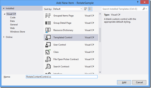
The project will create a new component class: WinRTComponent.cpp/.h. Delete these two files. We won’t need them. Instead, right-click project –> Add new item, and pick “Templated Control”.

image

This will add 3 new files, where the first two are:

MyDirectXControl.h:

#pragma once

#include "pch.h"

namespace MyControlsLibrary
{
    public ref class MyDirectXControl sealed : public Windows::UI::Xaml::Controls::Control
    {
    public:
        MyDirectXControl();
    };
}

MyDirectXControl.cpp:

#include "pch.h"
#include "MyDirectXControl.h"

using namespace MyControlsLibrary;

using namespace Platform;
using namespace Windows::Foundation;
using namespace Windows::Foundation::Collections;
using namespace Windows::UI::Xaml;
using namespace Windows::UI::Xaml::Controls;
using namespace Windows::UI::Xaml::Data;
using namespace Windows::UI::Xaml::Documents;
using namespace Windows::UI::Xaml::Input;
using namespace Windows::UI::Xaml::Interop;
using namespace Windows::UI::Xaml::Media;

MyDirectXControl::MyDirectXControl()
{
    DefaultStyleKey = "MyControlsLibrary.MyDirectXControl";
}

Also notice the comment at the top of the header file. This is important, and tells you to go open “pch.h” and add the following line at the bottom:

#include "MyDirectXControl.h"

I ignored this comment (ie. my brain refused to notice it) for hours until a friendly soul pointed it out – kinda annoying but just do it and move along.

The third file is the “Generic.xaml” template file. This is where the XAML that should be applied to the control is defined (this is exactly the same as in C#/VB.NET). We will open this and add a couple of minor changes highlighted in yellow, and remove the line crossed out:

<ResourceDictionary
    xmlns="http://schemas.microsoft.com/winfx/2006/xaml/presentation"
    xmlns:x="http://schemas.microsoft.com/winfx/2006/xaml"
    xmlns:local="using:MyControlsLibrary">

    <Style TargetType="local:MyDirectXControl">
        <Setter Property="Template">
            <Setter.Value>
                <ControlTemplate TargetType="local:MyDirectXControl">
                    <Border x:Name="DrawSurface"
                        Background="{TemplateBinding Background}"
                        BorderBrush="{TemplateBinding BorderBrush}"
                        BorderThickness="{TemplateBinding BorderThickness}">
                        <TextBlock Text="My DirectX Control" 
                                   HorizontalAlignment="Center"
                                   VerticalAlignment="Center" />
                    </Border>
                </ControlTemplate>
            </Setter.Value>
        </Setter>
    </Style>
</ResourceDictionary>

We name the border so we can get a reference to it from code behind (which we will get back to later), and also add a little text in the center just for fun.

Next let’s try and use this control in a C# app. Right-click on your solution and select Add New Project. Pick a blank C# Metro style application.

image

Right-click the “references” in this new project and select “Add references” and select your other project under the “Solutions” tab:

image

Now open BlankPage.xaml and add the highlighted sections:

<Page
    x:Class="Application1.BlankPage"
    xmlns="http://schemas.microsoft.com/winfx/2006/xaml/presentation"
    xmlns:x="http://schemas.microsoft.com/winfx/2006/xaml"
    xmlns:local="using:Application1"
    xmlns:d="http://schemas.microsoft.com/expression/blend/2008"
    xmlns:mc="http://schemas.openxmlformats.org/markup-compatibility/2006"
    xmlns:my="using:MyControlsLibrary"
    mc:Ignorable="d">

    <Grid Background="{StaticResource ApplicationPageBackgroundBrush}">
        
        <my:MyDirectXControl Background="Red" Width="400" Height="300" />
        
    </Grid>
</Page>

And you should see the control pop up in your designer (you won’t see the red color yet – I left it so you can better see it in this screenshot):

image

Awesome! We now got a XAML control built in C++ consumed by C#!
Now let’s continue and add some DirectX magic to this control…

The first step for this is to include the DirectX libraries. If you are a .net developer, it’s kinda like adding assembly references (but the experience will feel 1980s :-). Right-click your C++ project and select Properties. Navigate to Linker->Input, and add the following to “Additional Dependencies”: d2d1.lib;d3d11.lib;

image

Next, lets add some methods, overrides and private variables to MyDirectXControl.h file that we’ll be using for the our directx rendering:

#pragma once
#include <d3d11_1.h>
#include <dxgi1_2.h>
#include <wrl.h>
#include <windows.ui.xaml.media.dxinterop.h>

#include "pch.h"

namespace MyControlsLibrary
{
    public ref class MyDirectXControl sealed : public Windows::UI::Xaml::Controls::Control
    {
    public:
        MyDirectXControl();
        virtual void OnApplyTemplate() override;
        void Refresh();

    private:
        Windows::UI::Xaml::Media::Imaging::SurfaceImageSource^ CreateImageSource(int width, int height);
        void OnMapSurfaceSizeChanged(Platform::Object^ sender, Windows::UI::Xaml::SizeChangedEventArgs^ e);
        void Draw(int width, int height);

        // template child that holds the UI Element
        Windows::UI::Xaml::Controls::Border^                m_MapSurfaceElement;
        // surface image source
        Windows::UI::Xaml::Media::Imaging::SurfaceImageSource^ m_imageSource;
        // Native interface of the surface image source
        Microsoft::WRL::ComPtr<ISurfaceImageSourceNative>   m_imageSourceNative;
        // D3D device
        Microsoft::WRL::ComPtr<ID3D11Device>                m_d3dDevice;
        Microsoft::WRL::ComPtr<ID3D11DeviceContext>         m_d3dContext;
Windows::Foundation::EventRegistrationToken m_sizeChangedToken; }; }

The first we’ll implement is the “CreateImageSource” method which will generate a DirectX surface we can render to. We’ll be using SurfaceImageSource which is one of the 3 types of DirectX surfaces we can use for this:

using namespace Windows::UI::Xaml::Media::Imaging;
[...]
SurfaceImageSource^ MyDirectXControl::CreateImageSource(int width, int height)
{
    //Define the size of the shared surface by passing the height and width to 
    //the SurfaceImageSource constructor. You can also indicate whether the surface
    //needs alpha (opacity) support.
    SurfaceImageSource^  surfaceImageSource = ref new SurfaceImageSource(width, height, true);
    if(width <= 0 || height <= 0) return surfaceImageSource;
    

    //Get a pointer to ISurfaceImageSourceNative. Cast the SurfaceImageSource object
    //as IInspectable (or IUnknown), and call QueryInterface on it to get the underlying
    //ISurfaceImageSourceNative implementation. You use the methods defined on this 
    //implementation to set the device and run the draw operations.
    IInspectable* sisInspectable = (IInspectable*) reinterpret_cast<IInspectable*>(surfaceImageSource);
    sisInspectable->QueryInterface(__uuidof(ISurfaceImageSourceNative), (void **)&m_imageSourceNative);

    //Set the DXGI device by first calling D3D11CreateDevice and then passing the device and 
    //context to ISurfaceImageSourceNative::SetDevice. 

    // This flag adds support for surfaces with a different color channel ordering than the API default.
    // It is recommended usage, and is required for compatibility with Direct2D.
    UINT creationFlags = D3D11_CREATE_DEVICE_BGRA_SUPPORT;

#if defined(_DEBUG)
    // If the project is in a debug build, enable debugging via SDK Layers with this flag.
    creationFlags |= D3D11_CREATE_DEVICE_DEBUG;
#endif
     // This array defines the set of DirectX hardware feature levels this app will support.
    // Note the ordering should be preserved.
    D3D_FEATURE_LEVEL featureLevels[] = 
    {
        D3D_FEATURE_LEVEL_11_1,
        D3D_FEATURE_LEVEL_11_0,
        D3D_FEATURE_LEVEL_10_1,
        D3D_FEATURE_LEVEL_10_0,
        D3D_FEATURE_LEVEL_9_3,
        D3D_FEATURE_LEVEL_9_2,
        D3D_FEATURE_LEVEL_9_1
    };

    HRESULT hr = D3D11CreateDevice(
            NULL,
            D3D_DRIVER_TYPE_HARDWARE,
            NULL,
            creationFlags,
            featureLevels,
            ARRAYSIZE(featureLevels),
            D3D11_SDK_VERSION,
            &m_d3dDevice,
            NULL,
            &m_d3dContext
            );
if(FAILED(hr))
throw ref new COMException(hr); Microsoft::WRL::ComPtr<IDXGIDevice> dxgiDevice; // Obtain the underlying DXGI device of the Direct3D11.1 device. m_d3dDevice.As(&dxgiDevice); m_imageSourceNative->SetDevice(dxgiDevice.Get()); return surfaceImageSource; }

This is all boiler-plate code from MSDN. You can find more information there about what the above code really do.

The next portion is the code that will actually do the draw. I’ll keep it simple here and just grab the background color of the control, and render that color to the surface.

using namespace Microsoft::WRL;
[...]
void MyDirectXControl::Draw(int width, int height)
{
    if(width <= 0 ||  height <= 0) return;
    ComPtr<IDXGISurface> surface;
    RECT updateRect = {0};
    updateRect.left = 0;
    updateRect.right = width;
    updateRect.top = 0;
    updateRect.bottom = height;
    POINT offset = {0};
    
    //Provide a pointer to IDXGISurface object to ISurfaceImageSourceNative::BeginDraw, and 
    //draw into that surface using DirectX. Only the area specified for update in the 
    //updateRect parameter is drawn. 
    //
    //This method returns the point (x,y) offset of the updated target rectangle in the offset
    //parameter. You use this offset to determine where to draw into inside the IDXGISurface.
    HRESULT beginDrawHR = m_imageSourceNative->BeginDraw(updateRect, &surface, &offset);
    if (beginDrawHR == DXGI_ERROR_DEVICE_REMOVED || beginDrawHR == DXGI_ERROR_DEVICE_RESET)
    {
              // device changed
    }
    else
    {
        // draw to IDXGISurface (the surface paramater)
        // get D3D texture from surface returned by BeginDraw
        ComPtr<ID3D11Texture2D> d3DTexture;
        surface.As(&d3DTexture);
        // create render target view
        ComPtr<ID3D11RenderTargetView> m_renderTargetView;
        m_d3dDevice->CreateRenderTargetView(d3DTexture.Get(), nullptr, &m_renderTargetView);
        auto brush = (SolidColorBrush^)this->Background;
        float a = brush->Color.A/255.0f;
        float r = brush->Color.R/255.0f;
        float g = brush->Color.G/255.0f;
        float b = brush->Color.B/255.0f;
         const float clearColor[4] = { r, g, b, a };
         m_d3dContext->ClearRenderTargetView(m_renderTargetView.Get(),clearColor);
    }

    // TODO: Add more draw calls here

    //Call ISurfaceImageSourceNative::EndDraw to complete the bitmap. Pass this bitmap to an ImageBrush.
    m_imageSourceNative->EndDraw();
}

The next thing we’ll implement is “OnApplyTemplate”, which is called when the template in Generic.xaml is applied. At this point we can get a reference to the Border element, and apply the SurfaceImageSource as a brush to the background of the border.

void MyDirectXControl::OnApplyTemplate() 
{
if(m_MapSurfaceElement != nullptr)
    {   
        m_MapSurfaceElement->SizeChanged -= m_sizeChangedToken;
        m_MapSurfaceElement = nullptr;
    }
    //Get template child for draw surface
    m_MapSurfaceElement = (Border^)GetTemplateChild("DrawSurface");
    if(m_MapSurfaceElement != nullptr)
    {
        int width = (int)m_MapSurfaceElement->ActualWidth;
        int height = (int)m_MapSurfaceElement->ActualHeight;
        m_imageSource = CreateImageSource(width, height);
        ImageBrush^ brush = ref new ImageBrush();
        brush->ImageSource = m_imageSource;
        m_MapSurfaceElement->Background = brush;
        m_sizeChangedToken = m_MapSurfaceElement->SizeChanged += 
ref new SizeChangedEventHandler(this, &MyDirectXControl::OnMapSurfaceSizeChanged); } }

Also notice that we attached a handler to when the border element changes its size. If this happen we need to recreate the surface and render it again:

//surface size changed handler
void MyDirectXControl::OnMapSurfaceSizeChanged(Platform::Object^ sender, Windows::UI::Xaml::SizeChangedEventArgs^ e)
{
    int width = (int)m_MapSurfaceElement->ActualWidth;
    int height = (int)m_MapSurfaceElement->ActualHeight;
    m_imageSource = CreateImageSource(width, height);
    Draw(width, height);
    ImageBrush^ brush = ref new ImageBrush();
    brush->ImageSource = m_imageSource;
    m_MapSurfaceElement->Background = brush;
}

Lastly, we have a Refresh() method that triggers a new draw. You can call this on your control to trigger a new rendering. Calls to should be triggered by a pulse and only happen when there’s something new to draw (like for instance changing the background brush).

void MyDirectXControl::Refresh()
{
    int width = (int)m_MapSurfaceElement->ActualWidth;
    int height = (int)m_MapSurfaceElement->ActualHeight;
    Draw(width, height);
}

And that’s it! We now have a complete XAML control that you can use in both your .NET and C++ XAML apps.

You can download the entire sample app here.

Also a big thanks goes out to Jeremiah Morrill for peer-reviewing this blog-post.

My API Design Mantras

This morning I read an interesting article by Charlie Kindel: “Don’t build API’s”. He talks about some of the issues with customers using your API in ways that you never thought they would be using it, and how you forever are stuck with supporting these ‘almost unsupported’ use-cases. I wouldn’t go as far as saying you shouldn’t be building an API at all. After all if your product is an SDK, this is what you would have to do Smile.

I love working on API design and have been fortunate enough to be able to do this for several years now on a daily basis. I’ve gotten caught by similar issues that Kindel experienced as well. So over time, I have built myself a couple of mantras when I work on an API, and it generally is about how ‘tight’ or ‘loose’ you design your API. A very tight API has very few public methods and extensibility points, where a very loose API exposes everything and allows everything to be extended. My mantras are:

Unless there’s a solid and strong use-case for it:

    • …don’t make any methods, events or properties public.
    • …don’t allow people to create instances of a class (keep your constructor internal or private).
    • …seal your classes to prevent inheritance.

In other words: ‘private’ and ‘sealed’ are the keywords I think of first, next ‘internal’, next ‘protected’ (if class isn’t sealed), and lastly (after a lot of thought) ‘public’. ‘virtual’ comes even later. An example of this could be an event argument for an event that only your control will be raising. There’s rarely a reason to create a public constructor1. The class won’t be inherited from, so mark it sealed. Lastly the properties rarely will have any public setters either (the common use-case there is the .Handled property you can set to prevent bubbling). A great side-effect of tightening your API is that your API is smaller, leaner and meaner. The user of your API won’t have to browse a gazillion members to find the method he needs to use. It’ll be easier for him to understand your API, hit the things he’s supposed to hit, and stay out of the parts that could shoot himself in the foot.

I’m not saying you shouldn’t make anything public (it wouldn’t be an API if you didn’t). What I’m saying is that there needs to be a great and well-understood use-case for each and every one. As Kindel points out, you have to be VERY aware that any public method WILL be used in a way you didn’t think of. And the moment you made it public, you will have to support it forever.

So what I’m saying is that if I can’t think of a solid real-world use-case, making something publicly accessible wouldn’t be my first choice. You can always come up with random use-cases, but are they real-world scenarios? Are they best practices? Would the be a better way to achieve a certain use-case? If you can’t think of any, I would recommend keeping it tight, until that use-case shows up and you can get to understand it. Unless it saves a lot of customers a lot of time (which is essentially the purpose of an API), “Nice-to-have” features are unimportant. Focus on the “must-haves” first.

Any private and internal code you have is used in a finite set of use-cases2. You know the code that calls these methods, and they are in your full control. If a customer comes to you and wants access to these parts of the code, I generally first:

  1. Try to fully understand what the user is trying to achieve. Is there a better way / best practice? Is he really just trying to work around a feature that’s missing from your API, and if so would it be better to provide that instead of opening up an internal API? (generally internal methods are merely a set of helper/utility methods that helps supporting the public API). This is why it’s so important to fully understand the use-case.
  2. If you loosen existing internal parts your API, remember that so far this part of your code has only been used by you. When it was designed it might not have gone through the thought process that it requires for being used for any number of unknown use-cases. Using it wrong could very likely destabilize your code. Perhaps your code wasn’t originally designed for this type of use at all (we of course try, but everyone cuts corners now and then, or avoids unnecessary checks for performance reasons). Also do you need to do some MAJOR refactoring first? Is it worth the risk and is the demand large enough? Ie if there’s a huge risk and small demand, is there a workaround the customer can use as an alternative?

Let me say it again: You will have to support your public API forever! No more refactoring. No more major reworking to increase performance. No more major code cleanup. What you just did is now forever.

--------------------------------------------------------------------------------

1 In some unit-testing scenarios being able to create types are useful (luckily .NET lets you do this through reflection, and Visual Studio’s test suite helps you do it). Generally though you should be unit-testing your code, and your customer should just be testing their code.

2 Your internal API is also important - Keep things private unless ‘internal’ is really warranted, and try and make sure it can’t be misused - again as software evolves, your internal use might change and you will use your software in ways you didn’t originally think of - but at least here you’re not tied by ‘forever’ supporting it.

TiltEffect for Windows 8 Metro XAML

The tiles on the new Windows 8 Start Menu “tilts” when you press them, tilting toward the direction you click/touch them. This effect is also well known from the Windows Phone tiles. Unfortunately there is no out-of-the-box way of accomplishing this in either of the platforms. However for Windows Phone, a TiltEffect class is in the Silverlight Toolkit, so I figured I could just port that. Turns out it wasn’t that hard – all I pretty much had to do was change the manipulation events to use the new Pointer events instead, and will work with both mouse and touch.

To use it, first download the updated tilt effect class and add it to your project.

Next add a xmlns to register the namespace for use in XAML:

     xmlns:sg="using:SharpGIS.Metro.Controls"

And lastly add the tilt effect to your control exactly like  you would on the phone:

    <Rectangle Width="200" Height="200" Fill="Blue"
        sg:TiltEffect.IsTiltEnabled="True" />

Here’s what this look like on a couple of animated panels:

It’s worth noting that the tilt effect is not EXACTLY the same as the Windows 8 start menu, but it’s fairly close (and a bit cooler if you ask me Smile)

Why Custom Controls are underrated

I’m a big fan of building controls. I love writing them, designing them, trying to make it work in as many scenarios I can while keeping them simple, extensible and most importantly reusable. In fact for the past 6 years, it’s all I’ve been doing full time (first ASP.NET and later XAML), and frequently in my spare time as well.

If you dabble in XAML, you have most likely already been building some controls, by going “File -> New -> User Control” in Visual Studio. You probably do this because you want to create a new page in your app, or you just want to encapsulate some of the UI in a separate section. Or perhaps it’s because you realize that this little tidbit can be used over and over again in your application. Or maybe you have even considered it can be used again and again across many DIFFERENT applications. If you have tried those two last categories (or if you will one day), this blog post is for you! It will apply to any of the XAML techs there is: WPF, Silverlight, Windows Phone and the future Windows 8 Runtime.

Despite the title in this blog post, User Controls are awesome. They are quick to throw together and reuse over and over - and there’s a lot of value in that. But what if I told you there’s another control type that has even MORE power, better performance, and can be way more flexible and reusable than a user control, and where the clean code will make most developers fall in love?

The thing is you already know this because you’ve been using them all the time: Button, ListBox, ItemsControls, Grid, StackPanel etc. are all controls harnessing the same power you can! And you have probably seen XAML styles that completely changed the look and feel of a control, without touching any of its code. To give you an idea of how powerful this is, look at this Silverlight Sample below. On the left you will see a ListBox binding to a list of planets. You have probably already done something like this. On the right, you see a solar system. But in fact this is ALSO a ListBox. And there is NO extra code involved here. It’s done entirely by restyling the template. Notice how selection and up/down keys work just like it does with the “normal” ListBox. So I got to reuse all the code that has this, and all I had to do was restyle the ListBox a bit. Something I could have done entirely in Blend without ever touching code.

Let me repeat that: I didn’t add any code to the ListBox do this. In fact the code behind for this page is completely empty. If you don’t believe me, here’s the source code. You can also see more about this technique in this presentation from Mix’08, or read David Ansons blogpost on it.

So at this point hopefully I have won you over to learning more about Custom Controls (if not I’m amazed you have read this far :-).

The Anatomy of A User Control

To start, let’s first look at the anatomy of a typical UserControl and try and fully understand how that works first. Below here we have the XAML portion of our control that defines the layout. We’ll keep it simple and have a Grid with a Button inside it:

<UserControl x:Class="MyApp.SilverlightControl1"
    xmlns="http://schemas.microsoft.com/winfx/2006/xaml/presentation"
    xmlns:x="http://schemas.microsoft.com/winfx/2006/xaml">
    
    <Grid x:Name="LayoutRoot" Background="White">
        <Button Content="Click Me" Click="Button_Click" Opacity=".5" />
    </Grid>
</UserControl>

And we have the code-behind that loads up the control, handles user interaction etc.

using System.Windows;
using System.Windows.Controls;
using System.Windows.Media;

namespace SolarSystemRetemplate
{
    public partial class SilverlightControl1 : UserControl
    {
        public SilverlightControl1()
        {
            InitializeComponent();
        }

        private void Button_Click(object sender, RoutedEventArgs e)
        {
            LayoutRoot.Background = new SolidColorBrush(Colors.Red);
        }
    }
}

The things worth noting here are two things: “LayoutRoot” is defined in the XAML using x:Name, and we automatically get a variable by that name in code behind. Also the event handler hooked to the Button’s Click event is magically linked to the code-behind. All this is really handled by the compiler and the “InitializeComponent” call - a method that interestingly doesn’t exist here. The reason this works is really because this is a partial class as indicated, and Visual Studio creates a little ‘secret’ file under the covers for you. You can get to if if you right-click the method and select “Go To Definition”. Here’s what the contents of that file looks like:

namespace MyApp {    
    
    public partial class SilverlightControl1 : System.Windows.Controls.UserControl {
        
        internal System.Windows.Controls.Grid LayoutRoot;
        
        private bool _contentLoaded;
        
        /// <summary>
        /// InitializeComponent
        /// </summary>
        [System.Diagnostics.DebuggerNonUserCodeAttribute()]
        public void InitializeComponent() {
            if (_contentLoaded)
                return;
            _contentLoaded = true;
            System.Windows.Application.LoadComponent(this, 
new System.Uri("/MyApp;component/SilverlightControl1.xaml",
System.UriKind.Relative)); this.LayoutRoot = ((System.Windows.Controls.Grid)(this.FindName("LayoutRoot"))); } } }

You’ll notice that the LayoutRoot is defined here as internal, and it’s assigned using the “FindName” method.

This is one of the nice things about UserControls: A lot of the work is automatically done for you, but with Custom Controls you will have to do this yourself! (but this isn’t so bad considering the power you get!). And here’s the kicker: A UserControl is just another custom control!

The Anatomy of A Custom Control

A custom control doesn’t have a XAML and a code-behind component in the same way UserControl does. Instead it’s ALL code along with a default XAML template. You can consider the template the equivalent of the XAML in the User Control, but the important part to remember here is that this template can be changed by ANYONE, which is what I did to the ListBox in the solar system sample. Another thing to note is that since the template doesn’t have a corresponding code-behind where Visual Studio generates a partial class for you, any event handlers cannot be defined in the template. So how do we go about recreating the user control above as a custom control?

For Silverlight this is easy. Right-click your project and select “File -> Add New -> Silverlight Templated Control”. WPF and Windows Phone doesn’t come with this template so you’ll have to do it manually there, by creating a class and a generic template file. After you do this, you’ll notice two new files: First a simple C# class, and second a new file in \Themes\Generic.xaml. The second file is where you place all templates for all your controls in that assembly. It HAS to have this name and live in this folder for the custom control to pick up the template.

Below is what this template looks like. I’ve added the grid and the button inside the suggested border that was created for me.

<ResourceDictionary
    xmlns="http://schemas.microsoft.com/winfx/2006/xaml/presentation"
    xmlns:x="http://schemas.microsoft.com/winfx/2006/xaml"
    xmlns:local="clr-namespace:MyApp">

    <Style TargetType="local:TemplatedControl1">
        <Setter Property="Template">
            <Setter.Value>
                <ControlTemplate TargetType="local:TemplatedControl1">
                    <Border Background="{TemplateBinding Background}"
                            BorderBrush="{TemplateBinding BorderBrush}"
                            BorderThickness="{TemplateBinding BorderThickness}">
                        <Grid x:Name="LayoutRoot">
                            <Button x:Name="ClickButton" Content="Click me!" Opacity=".5" />
                        </Grid>
                    </Border>
                </ControlTemplate>
            </Setter.Value>
        </Setter>
    </Style>
</ResourceDictionary>

First notice the TemplateBinding statements on the border. This is an important feature of controls. You can bind straight to a dependency property defined in your control code. Since a custom control inherits from “Control”, you automatically get Background, BorderBrush, BorderThickness and many other general properties from the inheritance. The great thing is that you can just write <my:TemplatedControl Border=”Red” /> and the border will automatically be bound into this template (and anywhere else where you have a TemplateBinding to that property). This beats UserControl, where to accomplish this in Silverlight you will have resolve to a hack by setting the DataContext of the control to itself, breaking the DataContext flow.

Second, notice that I didn’t add a click-handler to Button. If I did, this template would fail to load. We’ll hook the click handler up later.

Next let’s look at the code for the control:

using System.Windows;
using System.Windows.Controls;
using System.Windows.Controls.Primitives;
using System.Windows.Media;

namespace MyApp
{
    [TemplatePart(Name="LayoutRoot", Type=typeof(Control))]
    [TemplatePart(Name = "ClickButton", Type = typeof(ButtonBase))]
    public class TemplatedControl1 : Control
    {
        Control layoutRoot;
        ButtonBase button;
        public TemplatedControl1()
        {
            this.DefaultStyleKey = typeof(TemplatedControl1);
        }
        public override void OnApplyTemplate()
        {
            if (button != null) //unhook from previous template part
            {
                button.Click -= new RoutedEventHandler(button_Click);
            }    
            button = GetTemplateChild("ClickButton") as ButtonBase;
            if (button != null)
            {
                button.Click += new RoutedEventHandler(button_Click);
            }
            layoutRoot = GetTemplateChild("LayoutRoot") as Panel;
            base.OnApplyTemplate();
        }

        private void button_Click(object sender, RoutedEventArgs e)
        {
            layoutRoot.Background = new SolidColorBrush(Colors.Red);
        }
    }
}

First I declare the “TemplatePart” attributes on the control. They tell what parts (ie controls) are expected to be in my template. In this case LayoutRoot of type Panel (Grid is a Control), and ClickButton of type ButtonBase. These are not strictly required, but they help Expression Blend understand the template requirements when you later customize the control. I always declare the lowest needed type in the control hierarchy to make the template more flexible. For instance I use ButtonBase and not Button, because I only rely on the Click event which is declared on the ButtonBase base class. That way I don’t lock a user of the control into using “Button” but they can place ANY control that inherits from ButtonBase here. Same thing applies for the LayoutRoot, where I just need the Background property.

Next the control inherits from “Control”. Custom controls must inherit from this.

In the constructor I define the “DefaultStyleKey”. This tells the framework that I have a default template defined in Themes\Generic.xaml. If I didn’t the user would always have to explicitly defined a control template for the control.

Lastly, the most important part is “OnApplyTemplate”. This method is called when the control has loaded the template. This is our earliest opportunity to grab references to controls in the template, ie. the TemplateParts. In this case I grab a reference to the ButtonBase defined in the template. If it’s found, I’ll add a click handler to it. Also if a new template gets applied, I must remember to unhook from the previous instance (this is a rare scenario though, and you could probably get away with skipping that bit). It’s also important to note that Template Parts are always optional! So always do the null check anywhere you rely on a reference to a template part.

And that’s really it! I kept the sample simple, so it is easier to go through the individual parts of a control, therefore the differences between a custom control and a user control doesn’t really stand out. If this was all you needed to do, a custom control is probably overkill. But think of scenarios where you have a lot of code-behind that you want to reuse, but you don’t want to lock the design in. The major next parts you will want to add to this now is more Dependency Properties you can bind into the template, as well as VisualStates - ie. storyboards that triggers on certain events. The great thing about Visual States is that the code-behind doesn’t define the storyboard or what it does - only when it starts. This gives the user even more flexibility to customize the behavior.

Adding Visual States to the control

Let’s add some mouse over states to our control, and have the control animate when that happens. In the code-behind where we defined the TemplateParts let’s add two TemplateVisualState attributes:

[TemplateVisualState(GroupName = "HoverStates", Name = "MouseOver")]
[TemplateVisualState(GroupName = "HoverStates", Name = "Normal")]

Again these are optional, but great for Blend integration.

Next add the code that triggers the visual state to the control:

bool isMouseOver;
protected override void OnMouseEnter(System.Windows.Input.MouseEventArgs e)
{
    isMouseOver = true;
    ChangeVisualState(true);
    base.OnMouseEnter(e);
}
protected override void OnMouseLeave(System.Windows.Input.MouseEventArgs e)
{
    isMouseOver = false;
    ChangeVisualState(true);
    base.OnMouseLeave(e);
}

private void ChangeVisualState(bool useTransitions)
{
    if (isMouseOver)
    {
        GoToState(useTransitions, "MouseOver");
    }
    else
    {
        GoToState(useTransitions, "Normal");
    }
}

private bool GoToState(bool useTransitions, string stateName)
{
    return VisualStateManager.GoToState(this, stateName, useTransitions);
}

This is really all the code we need. It’s pretty simple. If the mouse is over, trigger the MouseOver state, else trigger the Normal state. Note how we don’t really define what “MouseOver” looks like. That’s the job of the template. Let’s define that (you might already be very familiar with this when overriding templates - it’s exactly the same thing, except we get to define the default state):

<ControlTemplate TargetType="local:TemplatedControl1">
    <Border Background="{TemplateBinding Background}"
            BorderBrush="{TemplateBinding BorderBrush}"
            BorderThickness="{TemplateBinding BorderThickness}">
        <VisualStateManager.VisualStateGroups>
            <VisualStateGroup x:Name="HoverStates">
                <VisualState x:Name="MouseOver">
                    <Storyboard>
                        <ColorAnimation
                            Storyboard.TargetName="BackgroundElement"
                            Storyboard.TargetProperty="(Rectangle.Fill).(SolidColorBrush.Color)"
                            To="Yellow" Duration="0:0:.5" />
                    </Storyboard>
                </VisualState>
                <VisualState x:Name="Normal">
                    <Storyboard>
                        <ColorAnimation
                            Storyboard.TargetName="BackgroundElement"
                            Storyboard.TargetProperty="(Rectangle.Fill).(SolidColorBrush.Color)"
                            To="Transparent" Duration="0:0:.5" />
                    </Storyboard>
                </VisualState>
            </VisualStateGroup>
        </VisualStateManager.VisualStateGroups>
        <Grid x:Name="LayoutRoot">
            <Rectangle x:Name="BackgroundElement" Fill="Transparent" />
            <Button x:Name="ClickButton" 
                    Content="Click me!" Opacity=".5" />
        </Grid>
    </Border>
</ControlTemplate>

So the changes here is adding a rectangle in the background that we animate into yellow when the mouse hovers over.

You now have a control that sets a background on some Panel when some ButtonBase is clicked, as well as running an animation on MouseEnter/Leave. This could serve the purpose for quite a lot of controls, without you having to rewrite the code!

Here’s a few resources you will want to read if you want to learn more about this:

A couple of other controls I’ve built over the time and described on this blog:

If you want to go even more hardcore, wrap your head around the ArrangeOverride and MeasureOverride methods. This is where you can get some really amazing control over how the contents are laid out, but this is outside the scope of this article, but I urge you to read into it. Here’s one article to get your started on that: http://www.switchonthecode.com/tutorials/wpf-tutorial-creating-a-custom-panel-control

Overwriting the default WebRequest used by WebClient

In Silverlight/WPF and WPF there’s today a WebClient class for making webrequests. Under the covers it creates HttpWebRequest for sending the request and HttpWebResponse for handling the response coming back from the server. In an older blogpost, I created a custom WebClient for WP7 that added support for GZIP compression this way.

However the default WebClient doesn’t actually create an “HttpWebRequest/Response” object, since this is an abstract class. What it really does is create internal subclasses that is then used. This is handled by the WebRequestCreator static class which really creates these classes for you. However a less-known feature is that you can actually tell your application that you want to use a specific client for handling the web request and responses for specific domains. You might actually already have fiddled with this in Silverlight if you wanted to explicitly let Silverlight handle the web requests instead of handing it off to the hosting browser control using the following statement:

WebRequest.RegisterPrefix("http://www.mydomain.com/", WebRequestCreator.ClientHttp);

This call makes all requests to www.mydomain.com go through the ClientHttp. As mentioned it’s possible to make your own requestor and completely intercept ANY requests made by WebClient!

If you have your own HttpWebRequest implementation ‘MyHttpWebRequest’, this would look something like this:

public static class MyWebRequestCreator
{
    private static IWebRequestCreate myCreator;

    public static IWebRequestCreate MyHttp
    {
        get
        {
            if (myCreator == null)
            {
                myCreator = new MyHttpRequestCreator();
            }
            return myCreator;
        }
    }

    private class MyHttpRequestCreator : IWebRequestCreate
    {
        public WebRequest Create(Uri uri)
        {
            return new MyHttpWebRequest(uri);
        }
    }
}

So now you can just call:

WebRequest.RegisterPrefix("http://", MyWebRequestCreator.MyHttp);
WebRequest.RegisterPrefix("https://", MyWebRequestCreator.MyHttp);

…and ALL web requests to http or https websites, will be routed through your MyHttpWebRequest class (which you granted still have to build). This class could just wrap the built-in ClientHttpWebRequest and you can modify/add/remove/decode stuff to your pleasing. This is awesome for test framework mock ups, but it’s also really neat for the GZIP WebClient control I mentioned earlier. Why? Well to use my GZipWebClient, you would have to go through all your code and change:

WebClient client = new WebClient();

to

WebClient client = new SharpGIS.WebClient();

This can be a lot of work, and even if you did that, what about all the 3rd party libraries you use, where you can’t go in and change that? Well enter RegisterPrefix! Do you want GZIP support in Hammock? Done! Do you want GZIP support in RestSharp? Done!* Do you want GZIP support in [insert favorite API here]? Done!

*Update: Actually this might not be the case. Some libraries uses some features that either is not possible to implement with the custom HttpWebRequest (like UserAgent), and I didn’t add support for Cookies as well. Both of these are for instance used by RestSharp.

So I went ahead and updated my Nuget Package for the GZipWebClient, so go grab v1.1, and you will only have to add 1-2 LINES OF CODE, and just execute it ONCE (for instance at startup), and EVERYTHING WebClient will be enhanced with GZIP compression. You can also grab the updated source on the original blogpost here.

I really have to give some credit to my co-worker Anargyros for this one, who mentioned that it might be possible to do it this way. Go follow him on twitter and give him some twitter love @tomahawk1187

Building A Multi-Touch Photo Viewer Control

If you want to view an image on your Windows Phone app, or on your Windows 8 tablet, most people would probably expect to be able to use their fingers to pinch zoom and drag using the touch screen.

Since this is a common scenario, I want to create a simple reusable control that allows me to do this using very little xaml, along the lines of this:

<my:ImageViewer
    Thumbnail="http://url.com/to/my/thumbnail.jpg"
    Image="http://url.com/to/my/MyImage.jpg"  />

…where Thumbnail is a low resolution image that loads fast, while the full resolution Image is being downloaded.

If you just want to use this control and don’t want to learn how to create a custom control, skip to the bottom to download the source for both Windows Phone and Windows 8 Runtime.

First off, we’ll create a new Windows Phone Class Library project and name it “SharpGIS.Controls”. (or whatever you like)

image

Create a new folder “Themes”, add a new XAML resource file and name it “Generic.xaml”. Make sure the “build action” for this file is set to “ApplicationDefinition”.

We will want to define the default template in this file for our control (if you are used to making User Controls, this is essentially where the XAML for custom controls go instead).

In the xaml we will want two things: An image for displaying a fast-loading thumbnail at first, and a second image for displaying the high resolution image. Also we will use a Grid around them to group them together. Generic.xaml should look something like this:

<ResourceDictionary
    xmlns="http://schemas.microsoft.com/winfx/2006/xaml/presentation" 
    xmlns:x="http://schemas.microsoft.com/winfx/2006/xaml"
    xmlns:local="clr-namespace:SharpGIS.Controls">
    <Style TargetType="local:ImageViewer">
        <Setter Property="Template">
            <Setter.Value>
                <ControlTemplate TargetType="local:ImageViewer">
                    <Grid x:Name="Root" Background="Transparent">
                        <Image x:Name="Thumbnail" Source="{TemplateBinding Thumbnail}" CacheMode="BitmapCache" />
                        <Image x:Name="Image" Source="{TemplateBinding Image}" CacheMode="BitmapCache" />
                    </Grid>
                </ControlTemplate>
            </Setter.Value>
        </Setter>
    </Style>
</ResourceDictionary>

Notice the “CacheMode” property. This is important to set, to get proper performance when zooming and panning the image. If you have a Windows Phone try the official Facebook app, open an image and you will see what I mean (if you worked on that app PLEASE fix this).

Next up is the actual code. Add a new class, and name it “ImageViewer”. Make it inherit from ‘Control’. Add a constructor and use the “DefaultStyleKey” to tell Silverlight that you have a template defined in Generic.xaml that it should use.

public class ImageViewer : Control
{
    public ImageViewer()
    {
        DefaultStyleKey = typeof(ImageViewer);
    }
}

Next we define the dependency properties for the two images that the template was binding to:

public ImageSource Image
{
    get { return (ImageSource)GetValue(ImageProperty); }
    set { SetValue(ImageProperty, value); }
}

public static readonly DependencyProperty ImageProperty =
    DependencyProperty.Register("Image", typeof(ImageSource), typeof(ImageViewer), null);

public ImageSource Thumbnail
{
    get { return (ImageSource)GetValue(ThumbnailProperty); }
    set { SetValue(ThumbnailProperty, value); }
}

public static readonly DependencyProperty ThumbnailProperty =
    DependencyProperty.Register("Thumbnail", typeof(ImageSource), typeof(ImageViewer), null);

We should now be able to use this control in a Windows Phone project. Add a new Windows Phone Appplication project to your solution, right-click the ‘references’ and select “add reference’. Pick the SharpGIS.Controls project.

You should now be able to use some XAML like this to display an image:

<my:ImageViewer
    xmlns:my="clr-namespace:SharpGIS.Controls;assembly=SharpGIS.Controls"
    Thumbnail="http://url.com/to/my/thumbnail.jpg"
    Image="http://url.com/to/my/image.jpg" />

That’s all fine, but you still can’t use any touch to zoom the image.

Go back to the code and override OnApplyTemplate(). This code executes when the template from Themes\Generic.xaml has been loaded, and it’s your chance to grab any reference to the elements in there and ‘do something’ with them. In user controls you would often set the event handlers directly in the xaml. With templates on custom controls, you will have to hook these up in code-behind during OnApplyTemplate().

Here we will hook up for the manipulation events, as well as assign a transform we will apply to the element when these events trigger.

private Grid Root;
        
public override void OnApplyTemplate()
{
    Root = GetTemplateChild("Root") as Grid;
    if (Root != null)
    {
        Root.ManipulationDelta += Root_ManipulationDelta;
        Root.ManipulationStarted += Root_ManipulationStarted;
        Root.RenderTransform = new CompositeTransform();
    }
    base.OnApplyTemplate();
}

The ManipulationDelta event triggers as you move. It will give you information about how much the user dragged, and how much he/she pinches, as well as the center of the pinch. Unfortunately the pinch scale amount is shown as separate X and Y directions, and no ‘Uniform Scale’ is shown. This makes it hard to get a good average of the scale, and you would have to pick just one of them (one could be pinching and the other stretching).

I’ve found that defining the amount you’re scaling is the change of the length of the diagonal of the boundingbox of all the touch points works well. Errrrrrr, that might have sounded confusing. Let’s use a picture instead. The orange circles below are touchpoints, and the rectangle is the box that encompasses all of them (2 or more points). The blue line is the diagonal length of this box. So the amount of scaling = length_Before / length_After.

image

We don’t get the actual touch points in the manipulation events. So instead I start with a simple box that I define as 1x1 and track the scaling of it. The diagonal length of that box at the beginning is the square root of 2, which we will define in the ManipulationStarted event. We also add a property for tracking the center of the box.

private Point? lastOrigin;
private double lastUniformScale;

private void Root_ManipulationStarted(object sender, ManipulationStartedEventArgs e)
{
    lastUniformScale = Math.Sqrt(2);
    lastOrigin = null;
}

So all that’s left is listen to the ManipulationDelta event, and update the transform on the grid. This consist of comparing previous origin to the new, as well as calculating the scale factor based on the box diagonal. Also note that when you apply scale, this is means you’re scaling out and away from the upper left corner. To offset this, you will need to add some additional translation to the image, as shown below:

private void Root_ManipulationDelta(object sender, ManipulationDeltaEventArgs e)
{
    var transform = Root.RenderTransform as CompositeTransform;
    if (transform != null)
    {
        var origin = e.ManipulationContainer.TransformToVisual(this).Transform(e.ManipulationOrigin);

        if (!lastOrigin.HasValue)
            lastOrigin = origin;

        //Calculate uniform scale factor
        double uniformScale = Math.Sqrt(Math.Pow(e.CumulativeManipulation.Scale.X, 2) + 
                                        Math.Pow(e.CumulativeManipulation.Scale.Y, 2));
        if (uniformScale == 0)
            uniformScale = lastUniformScale;

        //Current scale factor
        double scale = uniformScale / lastUniformScale;

        if (scale > 0 && scale != 1)
        {
            //Apply scaling
            transform.ScaleY = transform.ScaleX *= scale;
            //Update the offset caused by this scaling
            var ul = Root.TransformToVisual(this).Transform(new Point());
            transform.TranslateX = origin.X - (origin.X - ul.X) * scale;
            transform.TranslateY = origin.Y - (origin.Y - ul.Y) * scale;
        }
        //Apply translate caused by drag
        transform.TranslateX += (origin.X - lastOrigin.Value.X);
        transform.TranslateY += (origin.Y - lastOrigin.Value.Y);

        //Cache values for next time
        lastOrigin = origin;
        lastUniformScale = uniformScale;
    }
}

And that’s it!

Now what’s left is to turn off the thumbnail when the image has loaded, as well as raise loaded events for the high resolution image, so that you can display a progress bar while you wait for the image to load. I won’t go into details on this, but in OnApplyTemplate, simply grab the Image template child, and listen for the ImageLoaded event.

I’ve packaged it all up in one complete control, as well as a sample showing how this would be used in an application where you would navigate to a page with this control on it.

You can download the source and a sample app here.

Here’s a preview off what that app looks like:

Reading and Writing text files in Windows 8 Metro

Perhaps I’m missing something here, but writing a simple text file and reading it back in is surprisingly complex in Windows 8 Metro style apps/WinRT. In .NET there’s a one-liner for such a trivial task, but I haven’t been able to find anything like that in WinRT. So to save you the trouble, here’s my utility methods for this:

Reading a file from the ApplicationData LocalFolder\DataCache:

public static async Task<string> ReadFile(string filename)
{
    var localFolder = Windows.Storage.ApplicationData.Current.LocalFolder;
    var folder = await localFolder.GetFolderAsync("DataCache");
    var file = await folder.GetFileAsync(filename);
    var fs = await file.OpenAsync(Windows.Storage.FileAccessMode.Read);
    var inStream = fs.GetInputStreamAt(0);
    Windows.Storage.Streams.DataReader reader = new Windows.Storage.Streams.DataReader(inStream);
    await reader.LoadAsync((uint)fs.Size);
    string data = reader.ReadString((uint)fs.Size);
    reader.DetachStream();
    return data;
}

Writing to a file in the ApplicationData LocalFolder\DataCache:

public static async void WriteFile(string filename, string contents)
{
    var localFolder = Windows.Storage.ApplicationData.Current.LocalFolder;
    var folder = await localFolder.CreateFolderAsync("DataCache", Windows.Storage.CreationCollisionOption.OpenIfExists);
    var file = await folder.CreateFileAsync(filename, Windows.Storage.CreationCollisionOption.ReplaceExisting);
    var fs = await file.OpenAsync(Windows.Storage.FileAccessMode.ReadWrite);
    var outStream = fs.GetOutputStreamAt(0);
    var dataWriter = new Windows.Storage.Streams.DataWriter(outStream);
    dataWriter.WriteString(contents);
    await dataWriter.StoreAsync();
    dataWriter.DetachStream();
    await outStream.FlushAsync();
}

I used this to create a little data cacher , as shown below (Note: you could use the LocalSettings for this, but there’s a very low limit to how large objects stored there can be):

public static void SaveData(string filename, object objectGraph, bool overwriteIfNull = true)
{
    string json = null;
    if(objectGraph != null)
        json = SerializeObjectGraph(objectGraph);
    if (json != null || overwriteIfNull)
    {
        WriteFile(filename, json);
    }
}

private static string SerializeObjectGraph(object graph)
{
    if (graph == null) return null;
    DataContractJsonSerializer ser = new DataContractJsonSerializer(graph.GetType());
    MemoryStream ms = new MemoryStream();
    ser.WriteObject(ms, graph);
    var bytes = ms.ToArray();
    return UTF8Encoding.UTF8.GetString(bytes, 0, bytes.Length);
}

public static async Task<T> LoadData<T>(string filename)
{
    var json = await ReadFile(filename);
    MemoryStream ms = new MemoryStream(UTF8Encoding.UTF8.GetBytes(json));
    DataContractJsonSerializer ser = new DataContractJsonSerializer(typeof(T));
    T result = (T)ser.ReadObject(ms);
    return result;
}

If there’s an easier way to do this, please do let me know. If not, hopefully we’ll get some more utility/helper methods as the SDK matures.

UPDATE: Turns out that there is an easier way to do this after all using the Windows.Storage.PathIO class!

Reading a text file in one line of code using WinRT:

string contents = await Windows.Storage.PathIO.ReadTextAsync("ms-appdata:///local/DataCache/test.txt");

Opening a managed stream using a path:

using (var stream = await Windows.Storage.ApplicationData.Current.LocalFolder.OpenStreamForReadAsync("DataCache\\test.txt"))
    using (var streamReader = new StreamReader(stream))
        contents = streamReader.ReadToEnd();

Similarly Windows.Storage.PathIO also have other neat one-liners. Check out the reference here: http://msdn.microsoft.com/en-us/library/windows/apps/windows.storage.pathio.aspx

Notice that there is also a WriteTextAsync(string,string) method. However this seems to throw an exception if the file doesn’t already exist, so I’m not sure how useful that is at this point, considering this will be a-chicken-and-the-egg scenario. So for now, the code above is still useful for writing files, and of course also for understanding the more low-level file operations.